LTA Performance
The LTA’s Performance team nurtures Britain’s top tennis talent, developing promising players into elite athletes.
They needed an identity that would unite players, coaches and staff behind a single ambition. I designed a bold, forward-leaning brand that captures that drive, built to work across print, digital and on-site branding, and to give everyone involved real pride in the team.
Overview
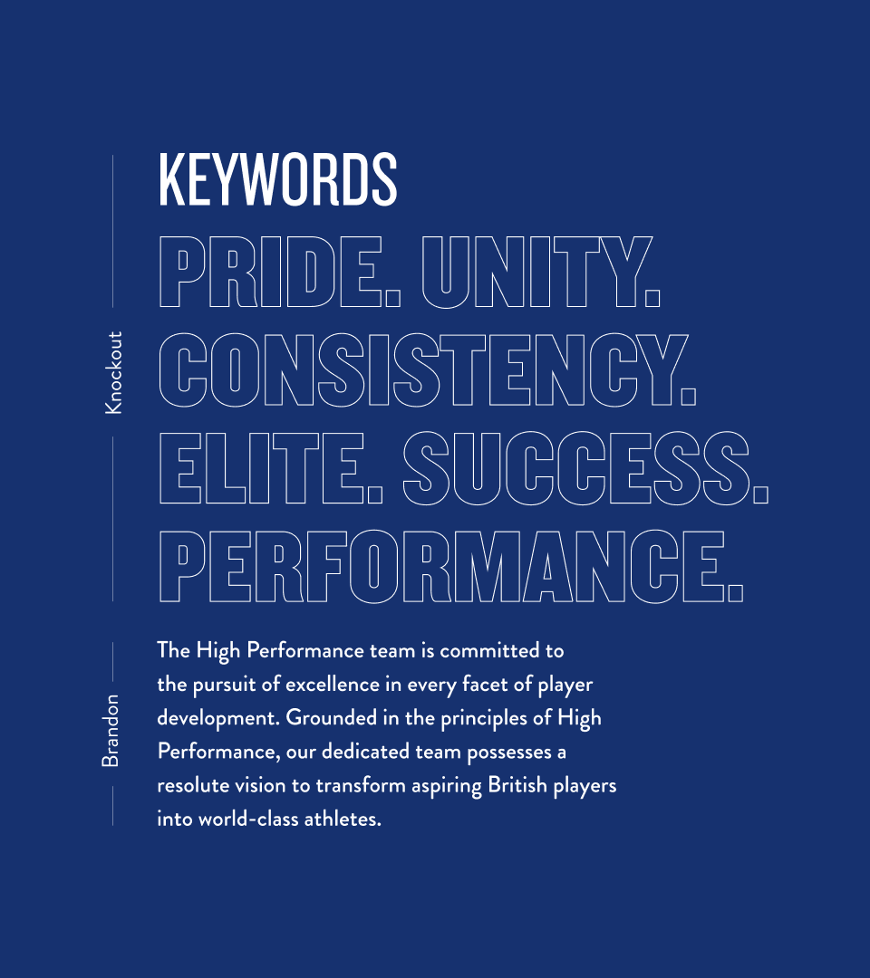
The identity needed to reflect a team dedicated to developing world-class athletes, while building a shared sense of pride. Bold typography and dynamic graphic elements give it strength and forward momentum, so it works as a rallying cry for athletes and staff alike.
The logo uses thick, tightly spaced block letters to express a solid, united team. An italic, angular cut adds speed and progress, while a strikethrough brings movement and precision and keeps it rooted in tennis.