The LTA’s Summer Grass Court Championships deliver fast-paced tennis action, bringing fans closer to the game at iconic UK venues.
Featuring the Nottingham Open, Birmingham Classic, and Eastbourne International, these tournaments offer world-class matches and high-energy atmospheres. Enthusiastic crowds and thrilling performances make each event a pivotal stop in the road to Wimbledon.
Overview
I was briefed to create brand identities for LTA’s prestigious Grass Court Championships, including the Nottingham Open, Birmingham Classic, and Eastbourne International. These key events lead up to Wimbledon, and my challenge was to give each tournament its own unique identity while maintaining a unified series look.
Working with the marketing and insights teams, we learned from past designs and workshoped ideas, refining a brand statement that set the tone for our visual approach. Our aim was to create dynamic, exuberant designs that captured both the local flavour and the excitement of the events.
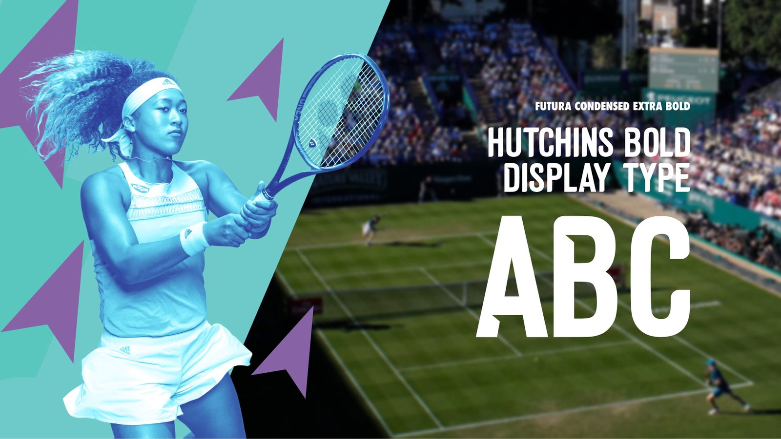
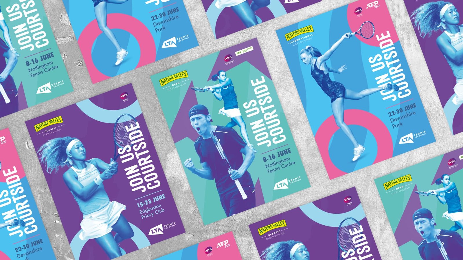
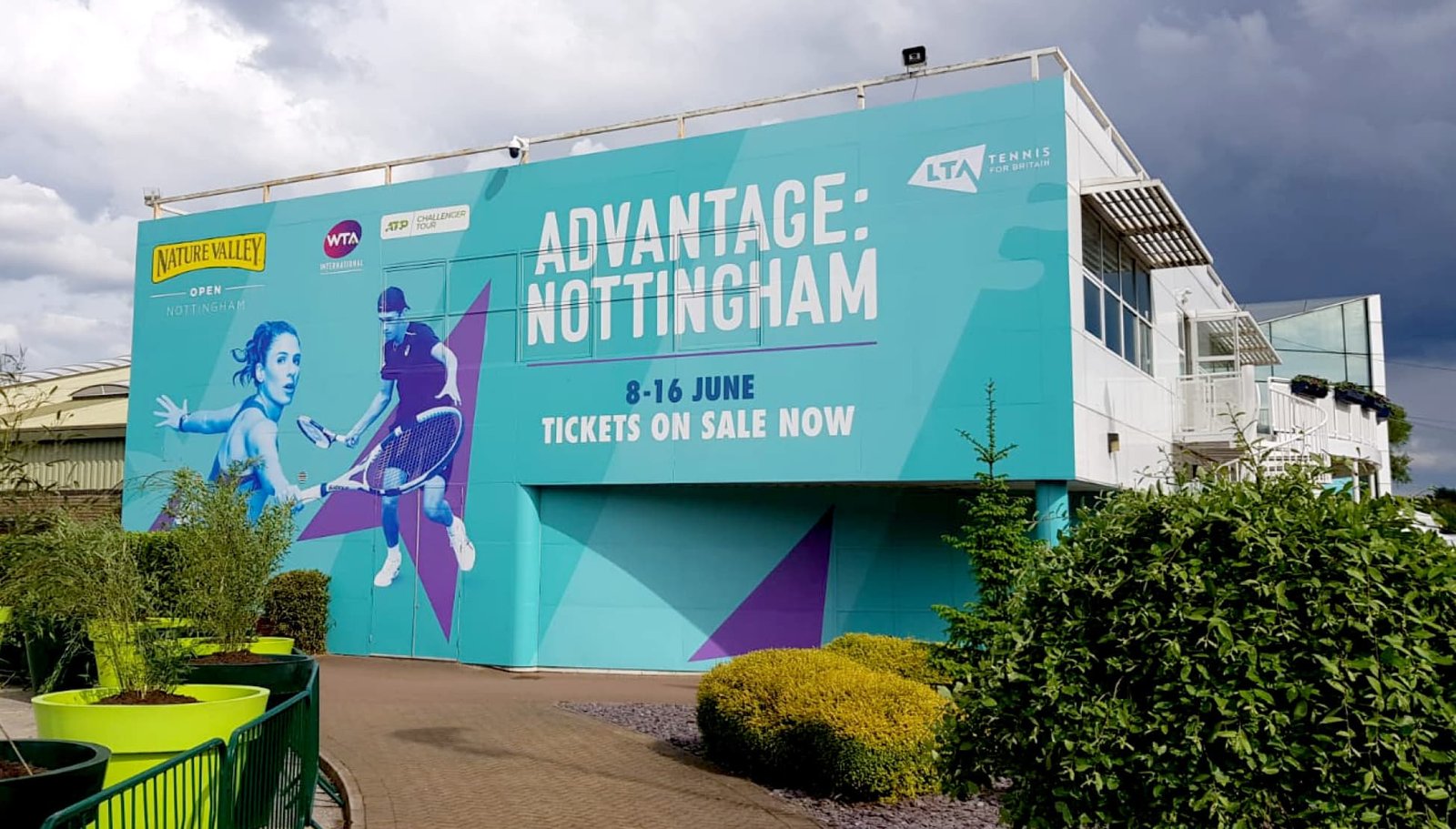
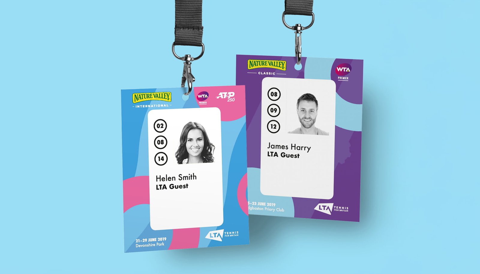
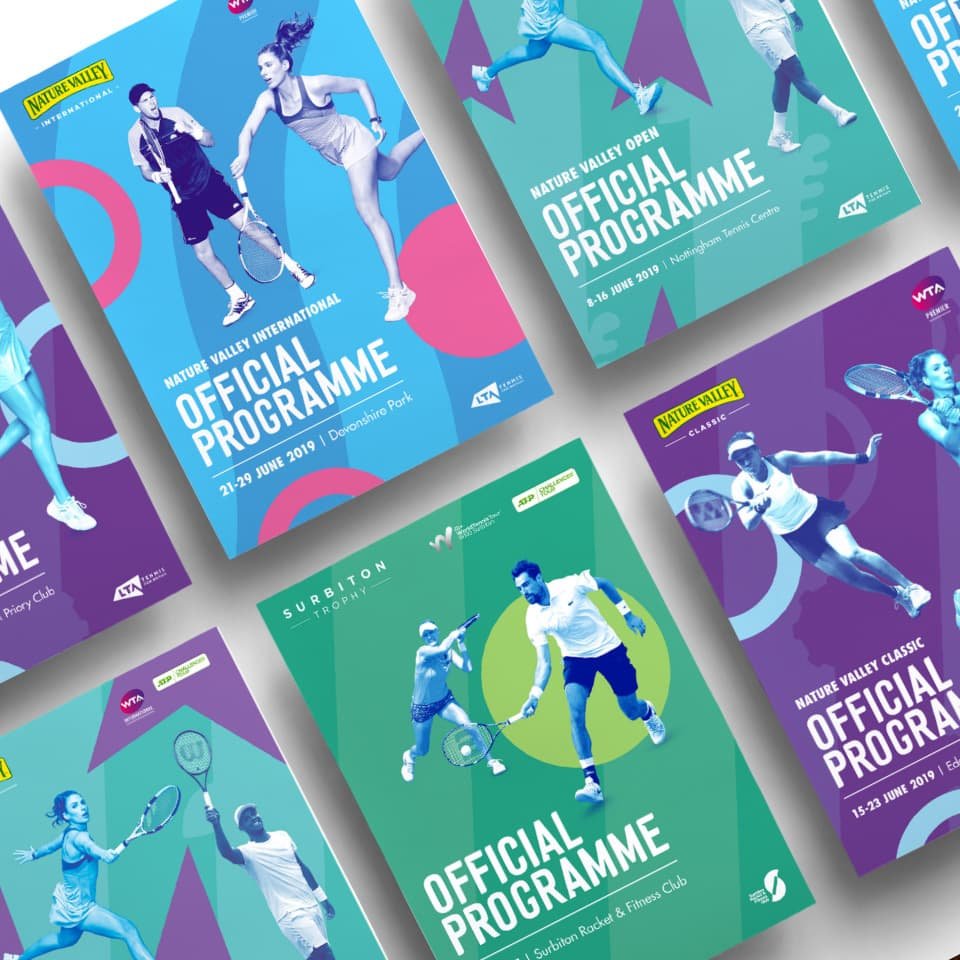
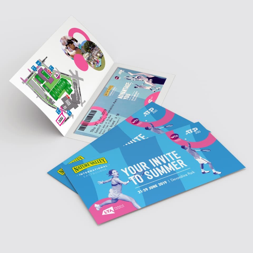
I began by designing a custom typeface, Hutchins Bold, to address two key challenges. First, the lack of a defining logo for the events meant we needed a unifying visual identity. Hutchins provided consistency across all event collateral, ensuring a cohesive brand presence. Second, its condensed style maximized the impact of marketing communications by making headlines bold and attention-grabbing. Paired with Futura for longer content and subheadlines, the typography balanced clarity and style.
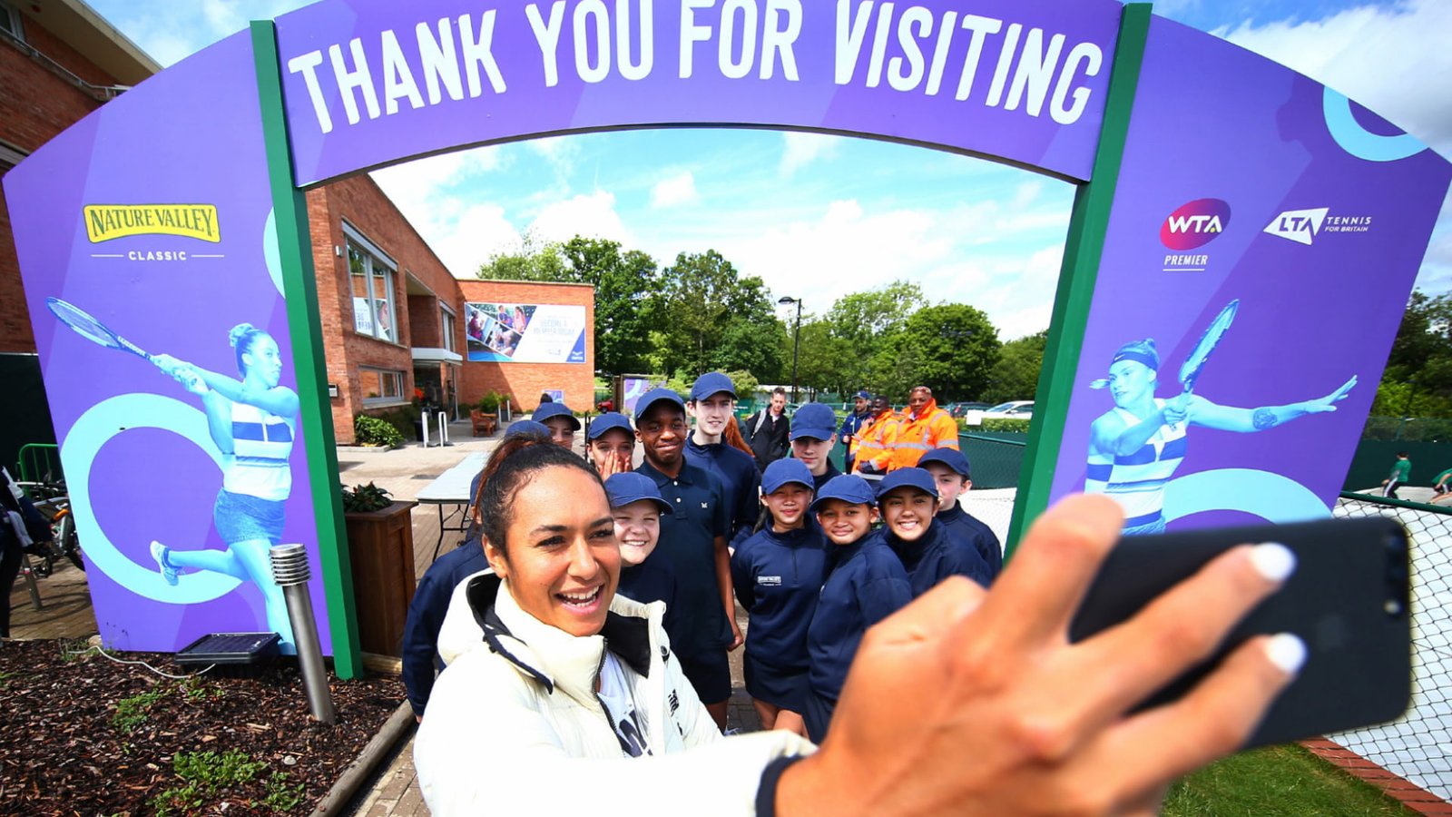
To unify photography, I applied a duotone effect to player images. This approach overcame inconsistencies from library-sourced photos shot in varying lighting conditions and created a cohesive color palette, regardless of differing kit colors.
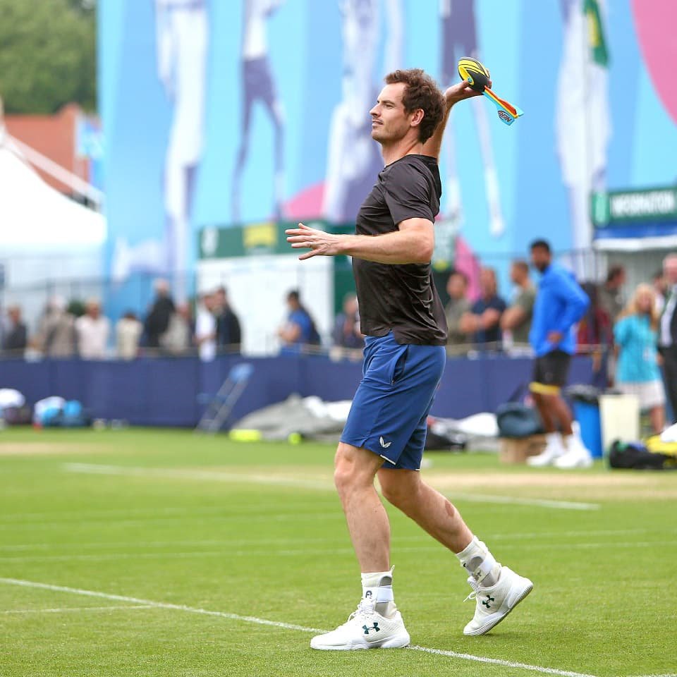
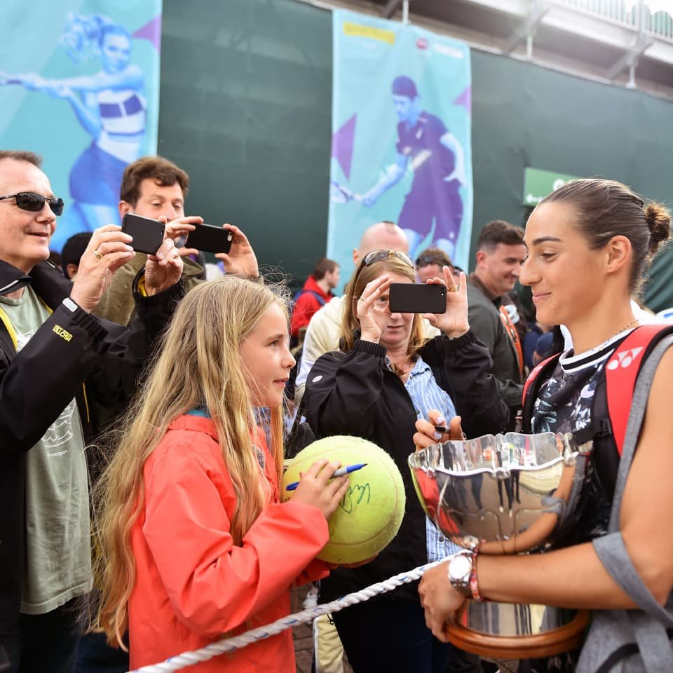
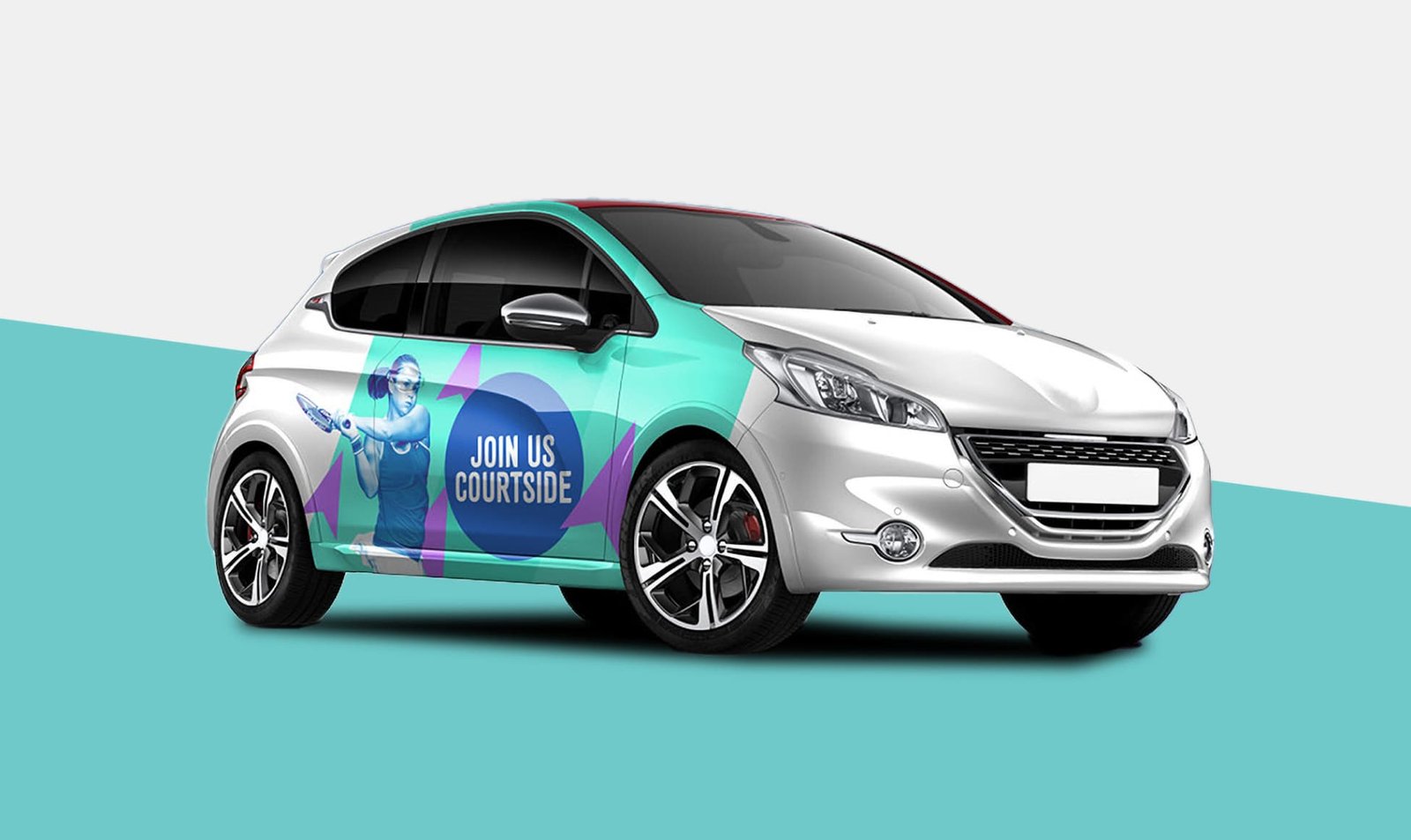
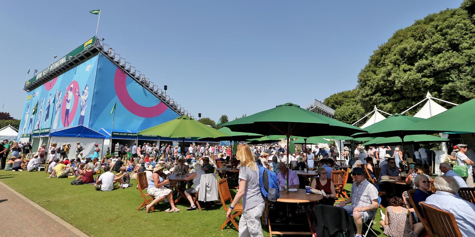
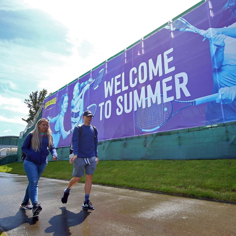
I designed a comprehensive visual identity system for the Grass Court Championships, balancing individuality and cohesion across three key events: Nottingham Open, Birmingham Classic, and Eastbourne International. Each event’s color palette reflected its locality—forest green for Nottingham, industrial purple for Birmingham, and ocean blue for Eastbourne. These were complemented by location-specific iconography, such as arrows and leaves, cogs, and waves. The identity was bold, energetic, and engaging, perfectly suited to the events’ dynamic atmosphere. I applied this system to over 1,000 branded features, including expansive building wraps and site-specific dressing, both on-site and off-site. Robust brand guidelines ensured that every application remained consistent, practical, and impactful, creating a seamless experience for attendees and a strong sense of place.