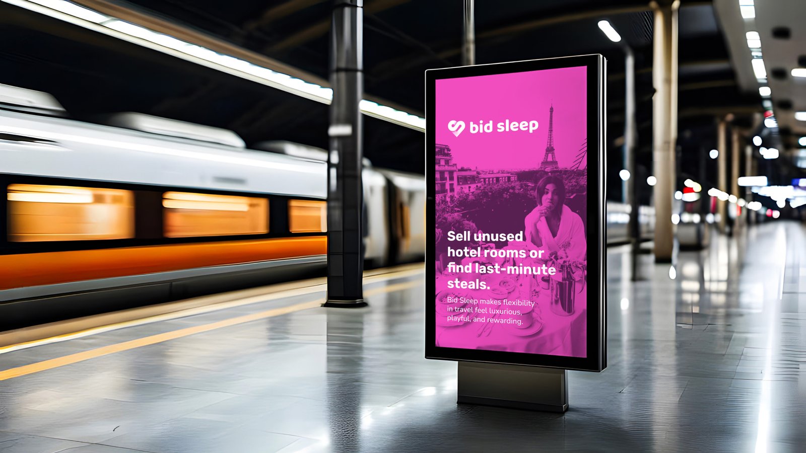
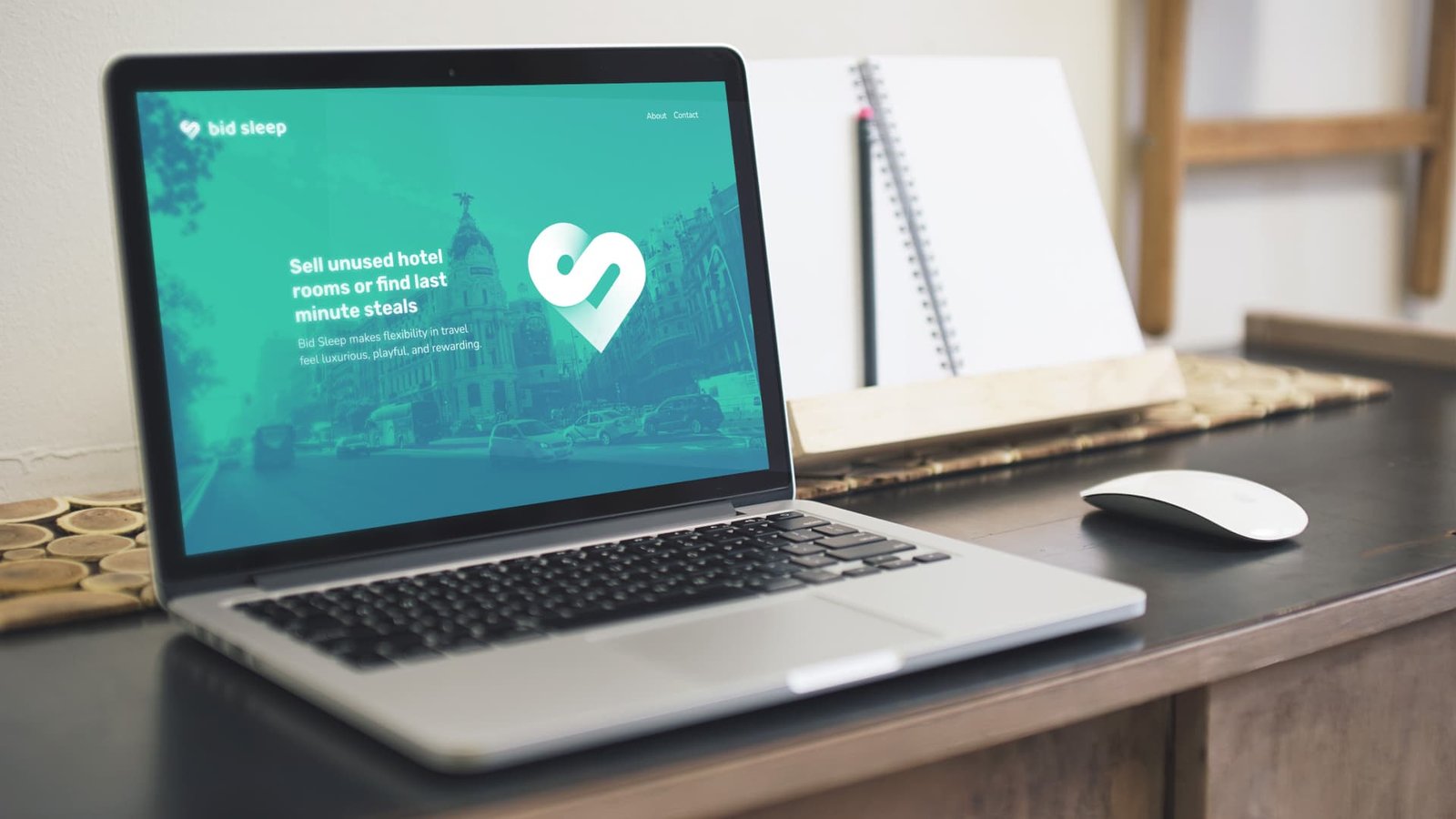
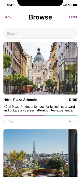
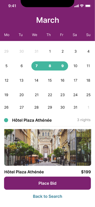
Bid Sleep captures the excitement of impulsive travel while offering a seamless, premium solution for reselling and booking hotel stays.
By connecting sellers and buyers, Bid Sleep redefines travel flexibility, creating a platform where unused hotel bookings turn into opportunities and last-minute plans feel effortless. Its playful yet polished brand identity reflects the excitement of seizing the moment, balancing light-hearted spontaneity with a premium aesthetic. Bid Sleep inspires adventurous audiences to embrace the freedom of impromptu getaways, offering stylish solutions that prioritise simplicity, convenience, and the joy of discovery.
Overview
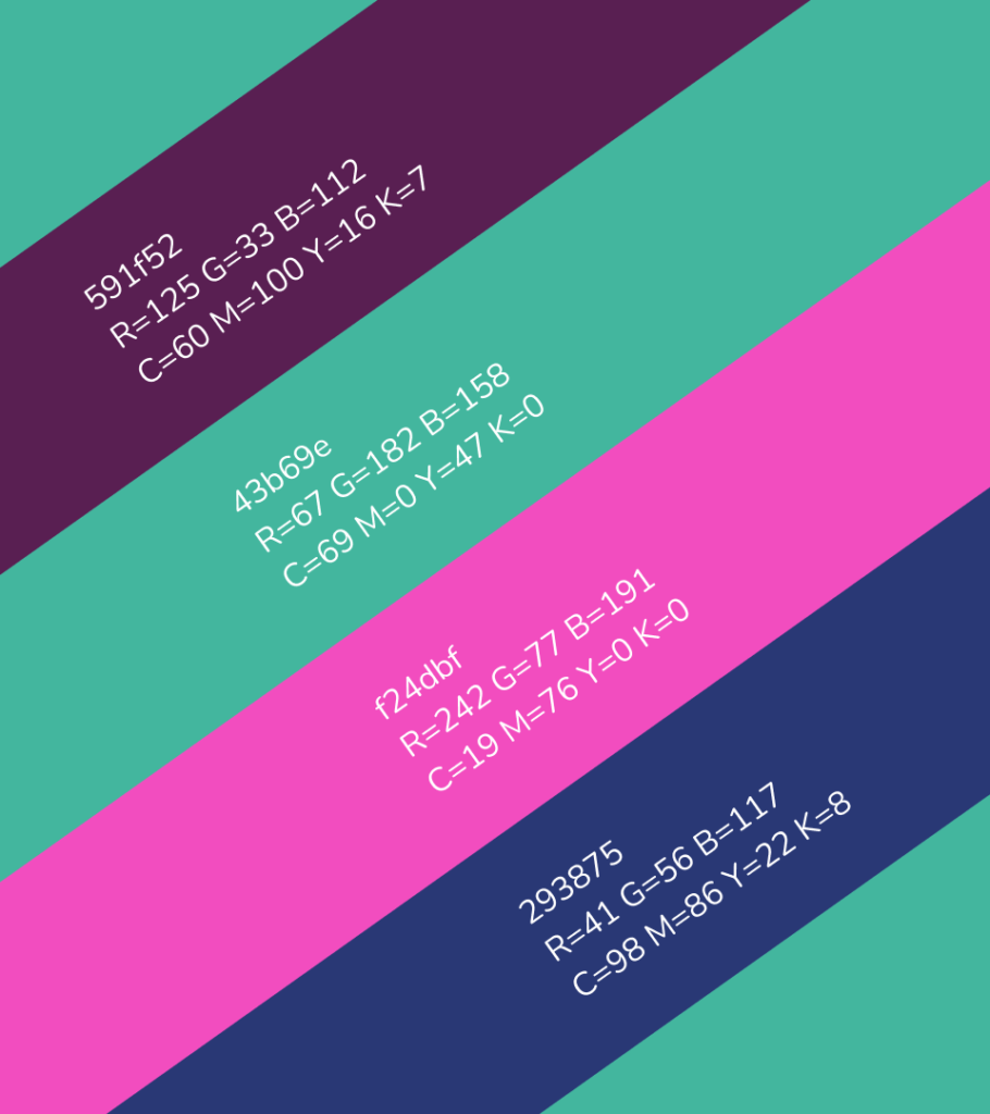
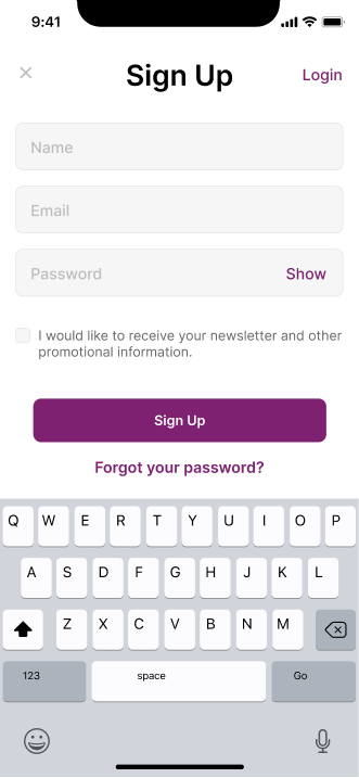
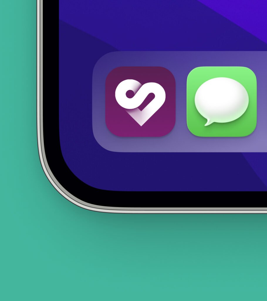
The visual identity of Bid Sleep was designed with a focus on flexibility, spontaneity, and a premium, aspirational feel. The logo creatively incorporates the initials “B” and “S” of Bid Sleep, subtly merging with a heart shape to symbolize the emotional connection to spontaneous travel experiences. The icon is modern and versatile, perfect for both app and digital use. Vibrant, fresh color choices, including muted blues, pinks, and oranges, were selected for their energetic, yet refined qualities, ensuring the brand feels exciting, accessible, and stylish in all digital platforms and UI elements.
Typography and Colour Palette
Rubik
With its geometric curves and modern appeal, Rubik provides clear, stylish headings that draw attention while maintaining readability. Its versatility makes it perfect for digital-first designs.
Nunito
A rounded sans-serif, Nunito offers excellent legibility and a friendly tone, ideal for extended text. Its soft edges complement the brand's approachable and playful identity.
Caveat
Caveat’s script style adds personality and flair, making it an ideal accent font for highlights, quotes, or straplines, emphasizing spontaneity and a premium, aspirational feel.